The entrance zone - the first encounter
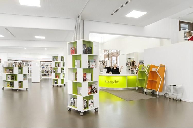
The entrance area creates a visitor’s first impression of the library
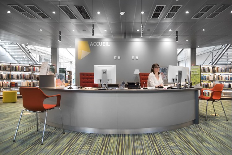
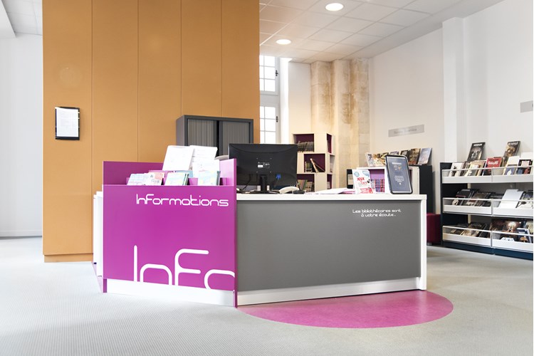
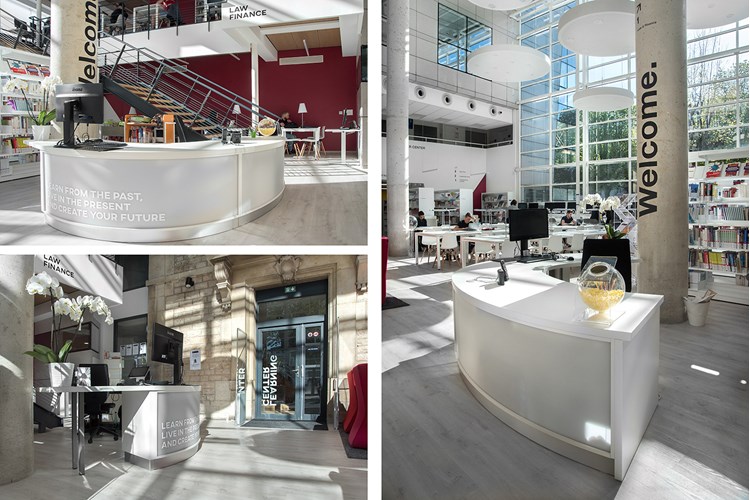
The first encounter (or the first impression for that matter) can be crucial. Whether we’re talking about a fully-staffed, reduce-staffed, or unstaffed library, your visitors should not only feel welcome but also be able to get their bearings quickly. Where can they get personal assistance or how can they help themselves? Questions that your visitors should be able to have answered when they step into the entrance zone.
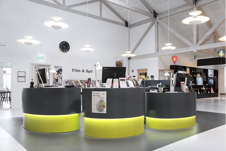
Planning and designing entrance zones with the help of various interior design solutions may be the answer. Here, we present some options for taking good care of your visitors – right from the first encounter.
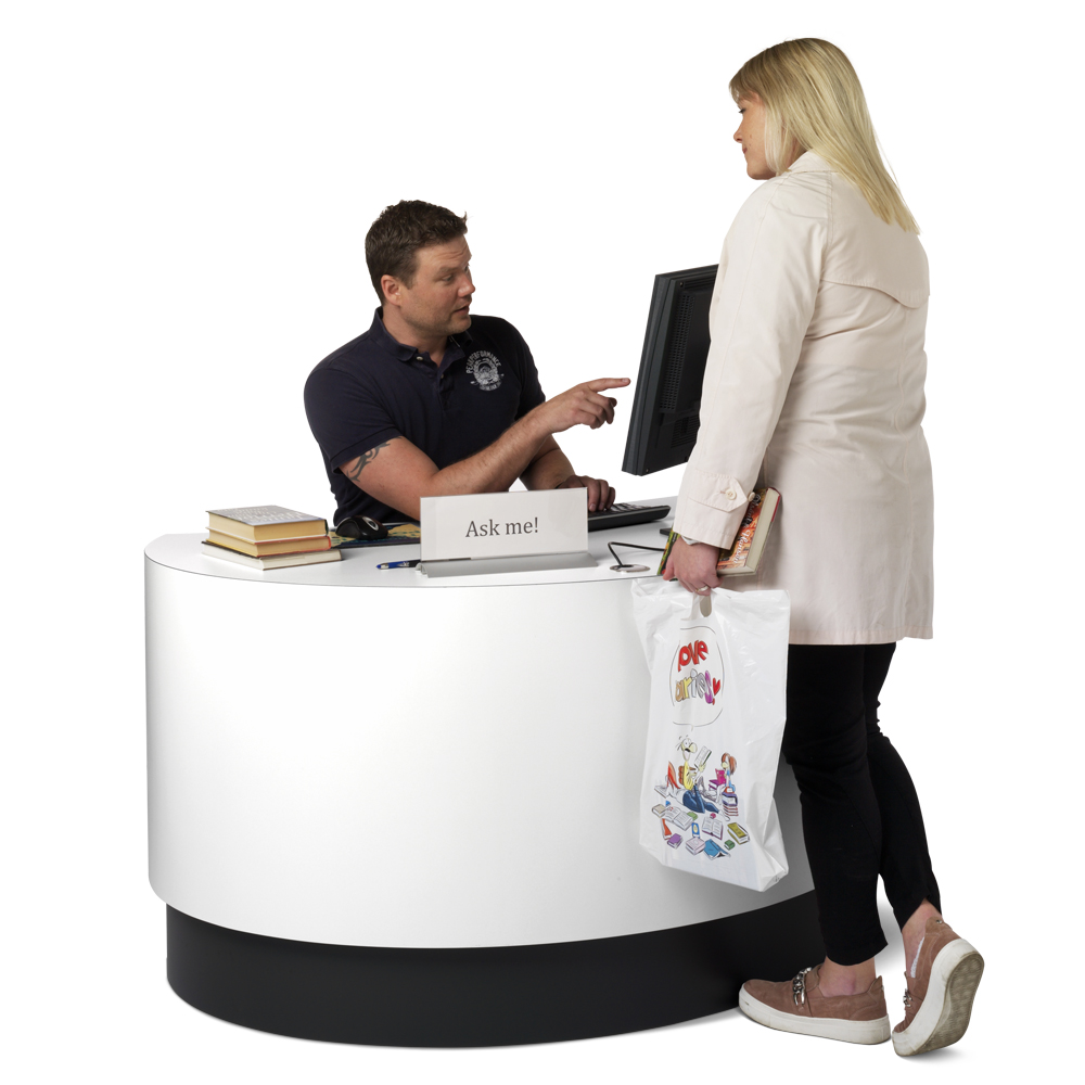

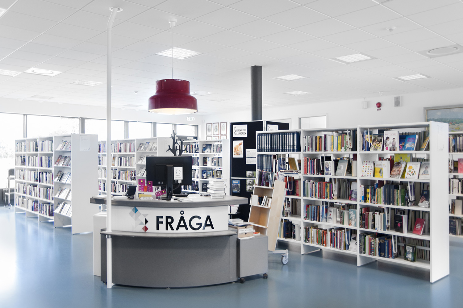
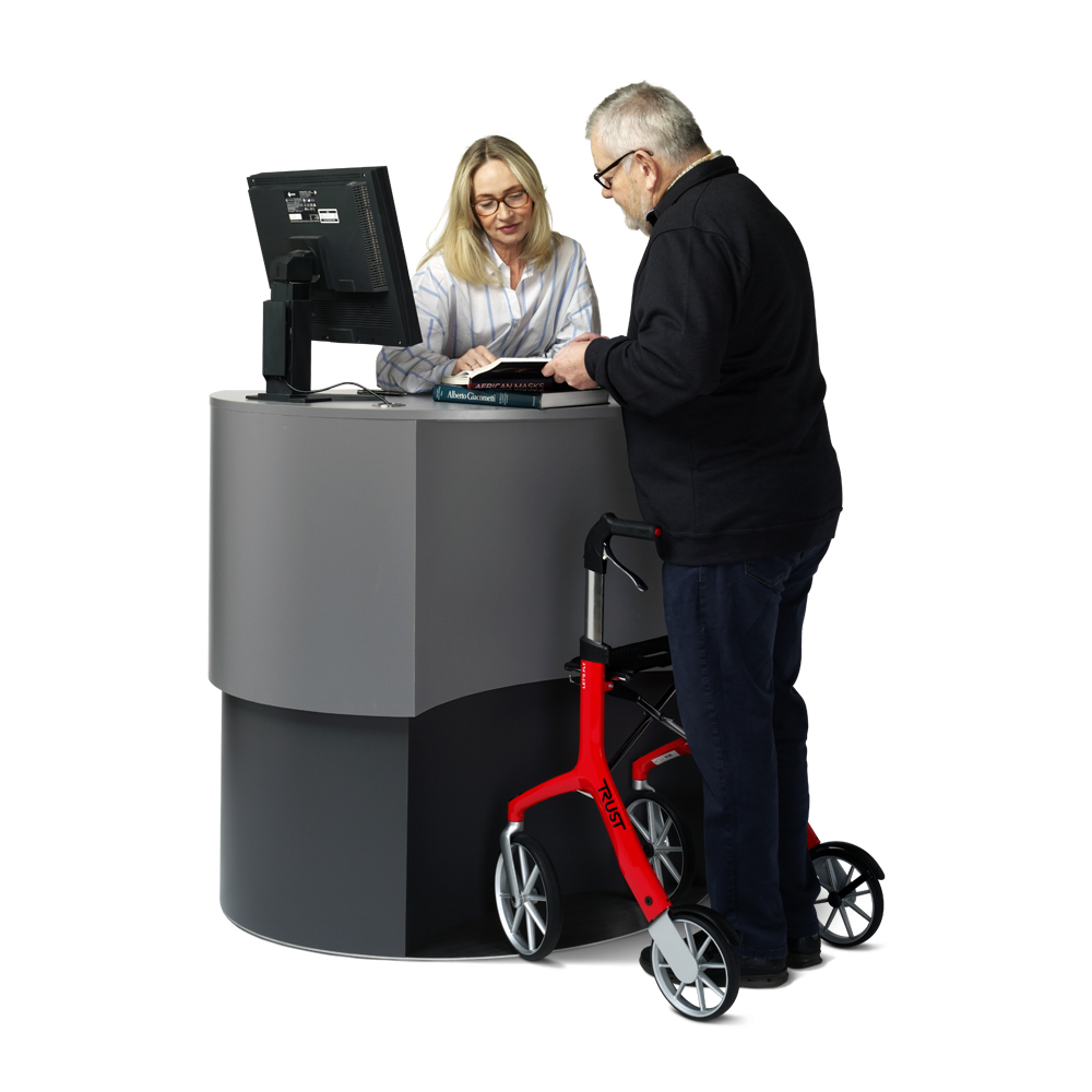
“Our new adjustable Info Pod with
recessed front is a great help to our
visitors as well as us staff. It facilitates
our work and our interactions with all of our
visitors. The counter makes it possible for
visitors to get closer with bulky bags, and
is also a help for visitors who use a
wheelchair or rollator. It feels great
to be able to help increase
accessibility at the library.”
Carina Bonde and Maria Nilsson,
Jonstorps Library, Höganäs Municipality, Sweden
Make your visitors feel invited
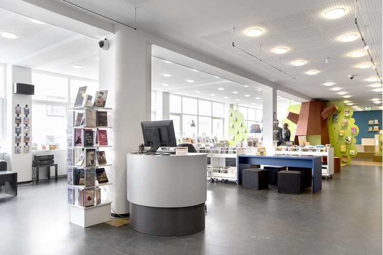
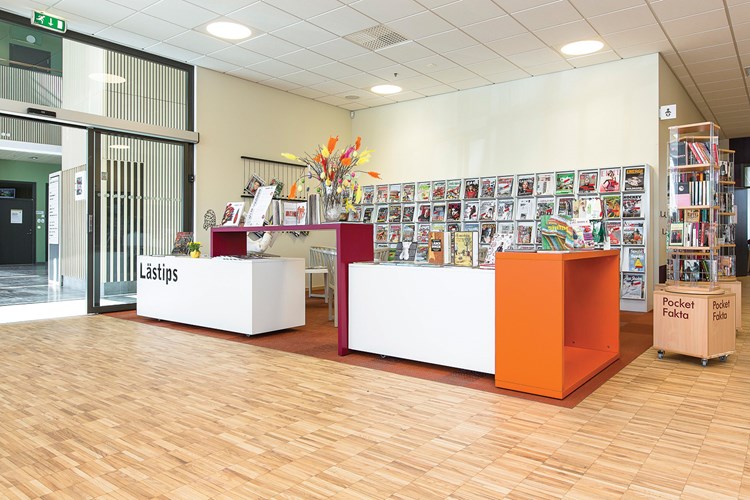
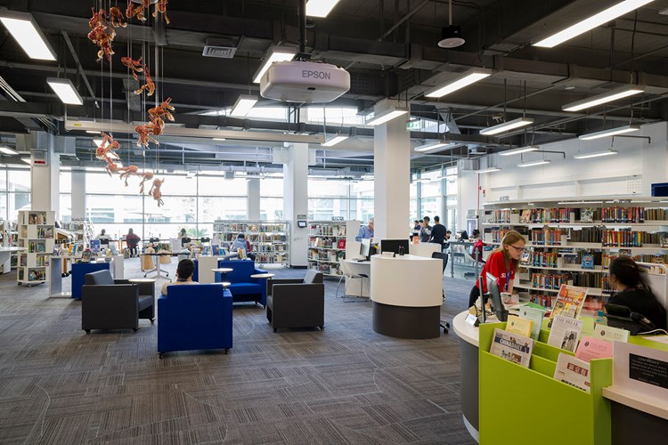
The idea is to keep the entrance area spacious and uncluttered, with uninterrupted views into the library
It sets the tone for the rest of the library and therefore needs to be welcoming, inviting and able to entice people into the library to explore.
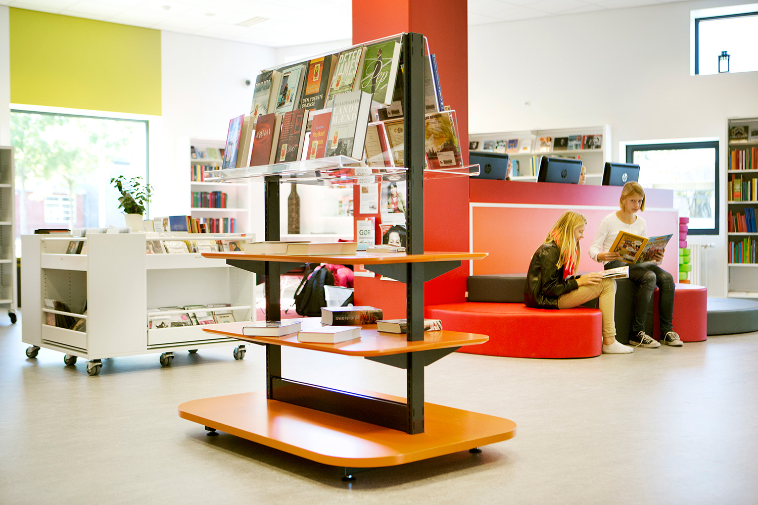
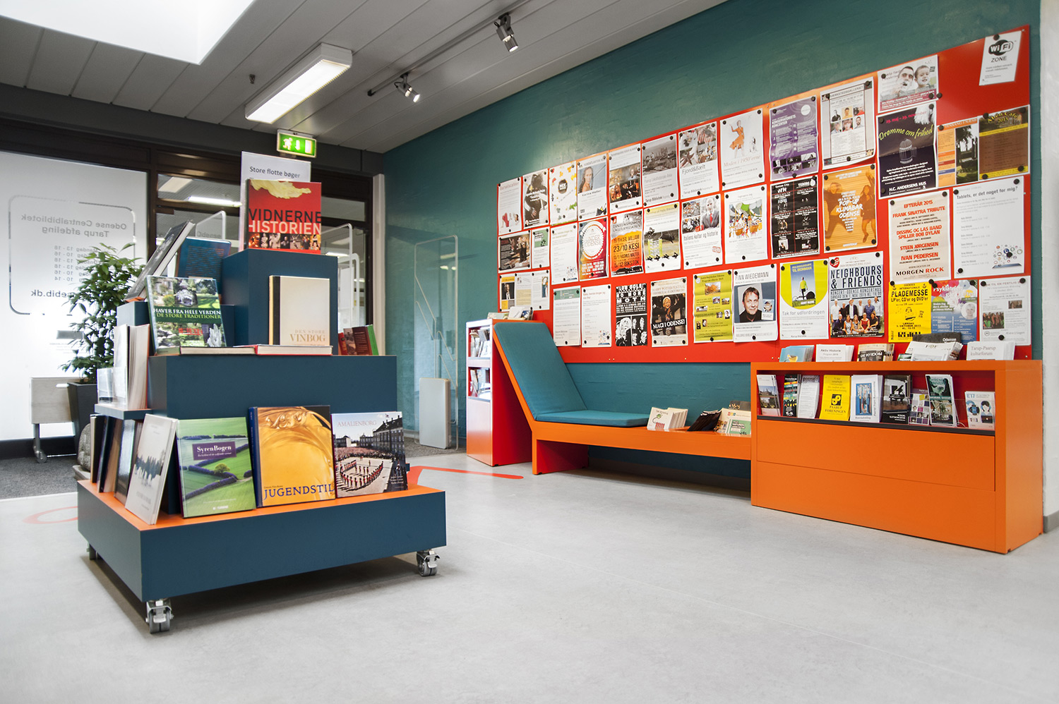
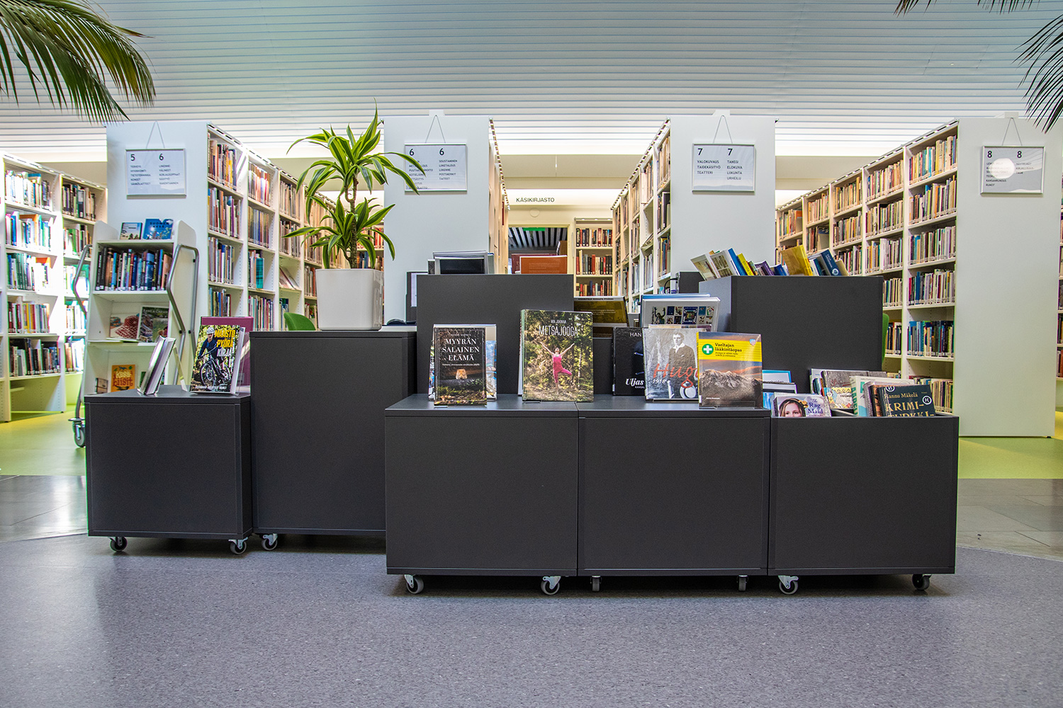
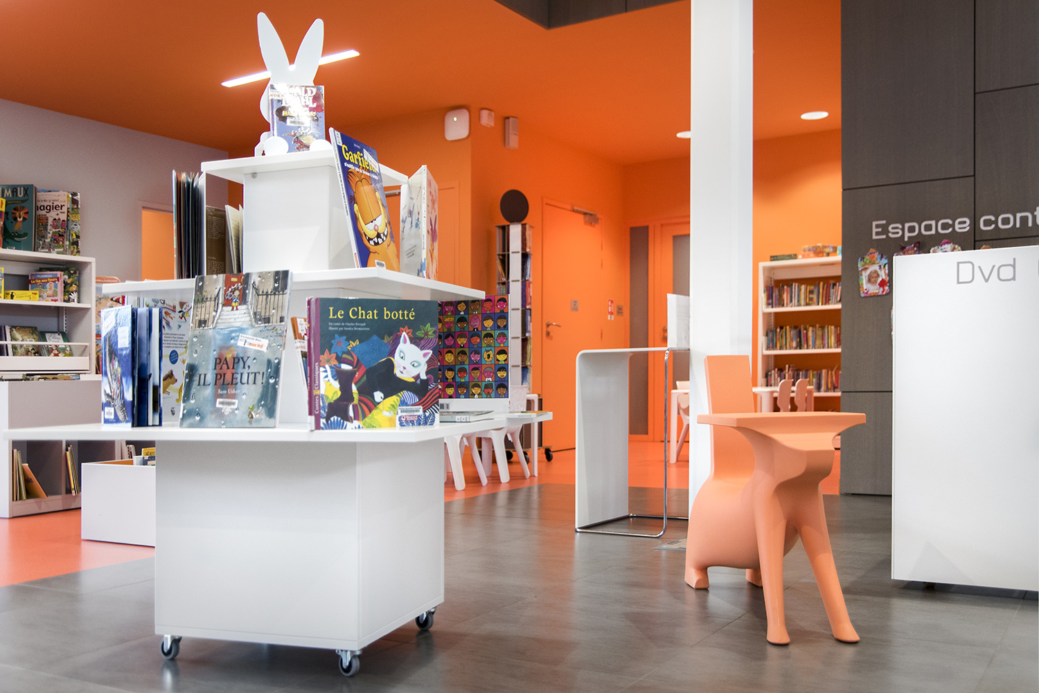
Using lower shelves and display units on wheels will create a feeling of openness, as well as give a degree of flexibility. This is also the opportune time to display your latest releases and new material, so create a retail feel in the entrance through the use of low level, face-on display that encourages visitors to pick up the books and engage with the media.
